Tag: MODIS

MODIS News and Events

fred_amo_2015243Hurricane Fred is the first to hit Cabo Verde since 1892. The storm caused flash flooding and wind damage.

The Moderate Resolution Imaging Spectroradiometer (MODIS) on Terra  acquired this natural-color image of Fred off the west coast Africa at 11:15 a.m. on August 31, 2015 Cabo Verde time, when the storm was at it’s peak  Wind speeds reached 75 knots.

The MODIS instrument on Terra also captured images on September 1st as Fred weakened, becoming a tropical storm.

Read more on NASA’s Earth Observatory.

isatemps_gis_2001The amount of vegetation in a city is an important factor in the urban heat island, where temperatures in urban areas rise an average of 1 to 3°C due to the absorption of  heat by asphalt, concrete, stone, steel, and other impervious surfaces. Vegetation helps cool these areas and a new study by NASA, shows how essential plant cover is.   Researchers modeled urban areas and their surroundings, using data from multiple satellites including MODIS on-board both Terra and Aqua and Landsat 7’s Enhanced Thematic Mapper Plus (EMT+), finding that areas covered partly by impervious surfaces had an average summer temperature 1.9°C higher than surrounding rural areas. In winter, the temperature difference was 1.5 °C higher. Lahouri Bounoua, a researcher at Goddard Space Flight Center and lead author, along with his colleagues used the model environment to simulate what the temperature would be for a city if all the impervious surfaces were replaced with vegetation.

Full story on the Earth Observatory

Full story on nasa.gov


globalcarbon_gis_2014

NASA Earth Observatory map by Joshua Stevens and Jesse Allen, using data from the Global Fire Assimilation System (GFAS) and the State of the Climate in 2014 report. Caption by Adam Voiland.

On Earth, there is always something burning. On a typical day in August, the Moderate Resolution Imaging Spectroradiometers (MODIS) on NASA’s Aqua and Terra satellites detect approximately 10,000 active fires, as well as huge swaths of freshly charred land in ecosystems ranging from boreal forests to savanna to tropical forests.

In order to determine how much carbon dioxide and other pollutants all these fires contribute to the atmosphere in a given year, scientists have developed computer models that combine satellite observations of burned area and active fires together with information about vegetation, fuel loads, and other details. Data produced by two computer modeling efforts—the Global Fire Assimilation System (GFAS) and the Global Fire Emissions Database (GFED)—were highlighted in NOAA’s 2014 State of the Climate report, published in the Bulletin of the American Meteorological Society. Read more

cirrus_cat_2015092

NASA Earth Observatory image by Jesse Allen, using data provided by John Yorks and Matthew McGill of the Cloud-Aerosol Transport System (CATS) team. Caption by Kathryn Hansen.

Cirrus—the wispy, icy clouds that form high in the atmosphere—are known to have a net warming effect on the climate. But how much? The question is hard to answer because even among cirrus clouds, there is wide variety and complexity in their structure.

The Moderate Resolution Imaging Spectroradiometer (MODIS) on NASA’s Terra satellite acquired a natural-color view of clouds over the South Pacific on April 2, 2015. Cirrus are the thinner clouds appearing to spread out from points across the center of the image.

The red line on the MODIS image shows the area scanned just hours before by the Cloud-Aerosol Transport System (CATS) onboard the International Space Station. “The space station orbit provides comprehensive coverage of the tropical and mid-latitude regions, where cirrus clouds are most prevalent,” said John Yorks, science lead of the CATS team at NASA’s Goddard Space Flight Center. Read more

For two weeks in late June and early July 2015, western Europe and the Pacific Northwest of North America endured record-setting heat and parched landscapes. Other parts of the world got a taste of the heat, too, as new temperature records were set on three continents.

The map above shows daytime land surface temperature anomalies in Europe from June 30 to July 9, 2015. Temperatures for those ten days are compared to the 2001–2010 average for the same period. Shades of red depict areas where the land surface was hotter than the long-term average; areas in blue were below average. White pixels were normal, and gray pixels did not have enough data, most likely due to excessive cloud cover.

This temperature anomaly map is based on data from the Moderate Resolution Imaging Spectroradiometer (MODIS) on NASA’s Terra satellite. Observed by satellites uniformly around the world, land surface temperatures (LSTs) are not the same as air temperatures. LSTs reflect the heating of the land by sunlight, and they can sometimes be significantly hotter or cooler than air temperatures. Read more

europelsta_tmo_2015190

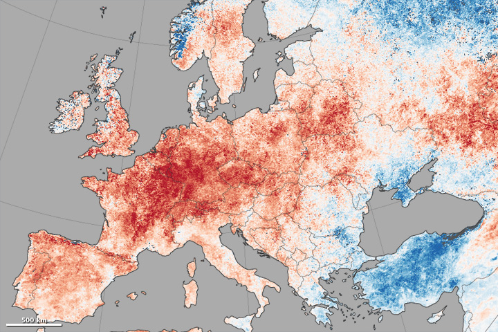
NASA Earth Observatory images created by Jesse Allen, using Land Surface Data from the MODIS Science Team. Caption by Michael Carlowicz.
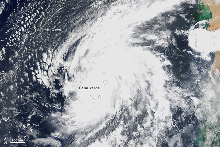