

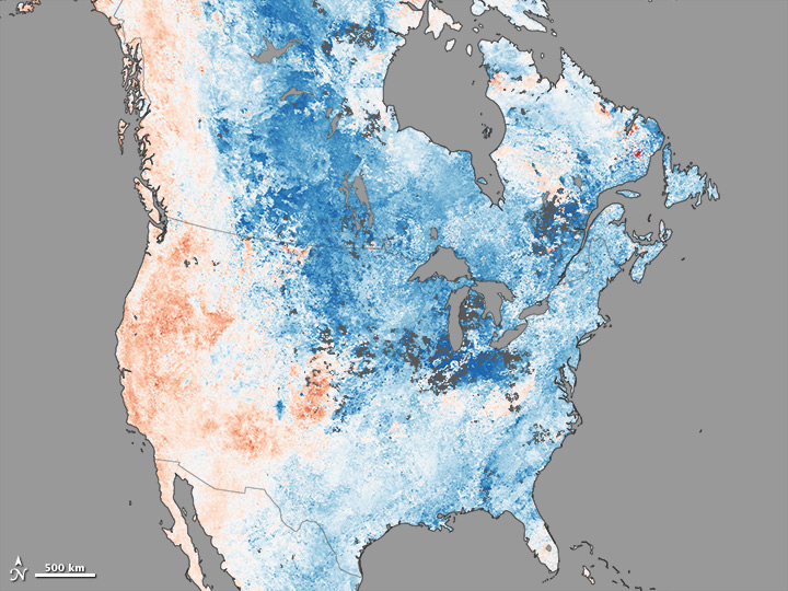
The map above shows land surface temperature anomalies in North America for January 1-7, 2014. Based on data from the Moderate Resolution Imaging Spectroradiometer (MODIS) on NASA’s Terra satellite, the map depicts temperatures for that period compared to the 2001-2010 average for the same week. Areas with warmer than average temperatures are shown in red; near-normal temperatures are white; and areas that were cooler than the base period are blue. Gray indicates areas where clouds blocked the satellite from collecting usable data. While much of the United States was experiencing frigidly cold temperature, Sochi Russia was warmer than average. Read more
- NASA Earth Observatory image by Jesse Allen, using data from the Level 1 and Atmospheres Active Distribution System (LAADS). Caption by Adam Voiland, with information from Paul Newman (NASA Goddard), Marshall Shepherd (University of Georgia), and John Knox (University of Georgia).