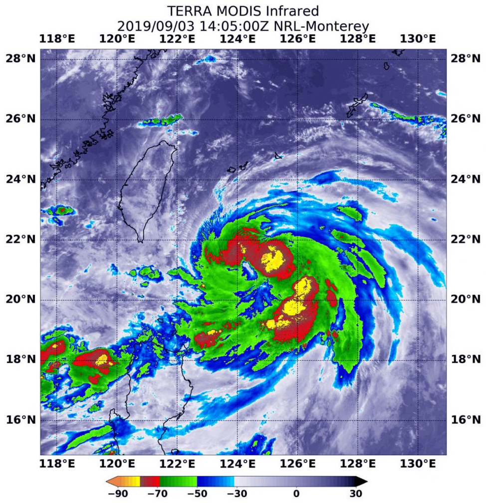
Sep. 03, 2019 – NASA Infrared Eye Analyzes Typhoon Lingling
The storm that became
Typhoon Lingling strengthened very quickly in the Northwestern Pacific Ocean
and infrared imagery from NASA revealed the powerful thunderstorms fueling that
intensification.
On
Sept. 3 at 12:05 p.m. EDT (1405 UTC) the MODIS instrument that flies aboard
NASA’s Terra satellite showed areas northeast and southeast of Typhoon
Lingling’s center where cloud top temperatures were as cold as minus 80 degrees
Fahrenheit (minus 62.2 Celsius). Credit: NASA/NRL
Lingling formed on Sept.
2 as Tropical Depression 15W and strengthened quickly into a tropical storm and
then a typhoon. Although Lingling is to the northeast of Luzon, northern
Philippines, there are still some warning signals in effect on Sept. 3.
Tropical cyclone wind signal #1 is in effect over the Luzon province of
Batanes.
On Sept. 3 at 12:05 p.m.
EDT (1405 UTC), the Moderate Imaging Spectroradiometer or MODIS instrument that
flies aboard NASA’s Terra satellite used infrared light to analyze the strength
of storms within the typhoon. NASA researches these storms to determine how
they rapidly intensify, develop and behave.
Tropical cyclones are
made of up hundreds of thunderstorms, and infrared data can show where the
strongest storms are located. They can do that because infrared data provides
temperature information, and the strongest thunderstorms that reach highest
into the atmosphere have the coldest cloud top temperatures.
MODIS found those
strongest storms were northeast and southeast of the center of circulation
where cloud top temperatures were as cold as minus 80 degrees Fahrenheit (minus
62.2 Celsius). NASA research has found that cloud top temperatures that cold
indicate strong storms with the potential to generate heavy rainfall.
At 11 a.m. EDT (1500
UTC), the Joint Typhoon Warning Center or JTWC said that Typhoon Lingling,
known locally in the Philippines as Liwayway was located near 21.4 degrees
north latitude and 124.2 degrees east longitude. That is 364 nautical miles
southwest of Kadena Air Base, Okinawa, Japan. Lingling was moving to the north
and had maximum sustained winds near 65 knots (75 mph/120.3 kph).
JTWC forecasters said
that Lingling is moving north and is expected to intensify to 100 knots (115
mph/185 kph) upon passing east of Taiwan. The system will then weaken on
approach to the Korean peninsula, but still be at typhoon strength.
How tall is Mount
Everest? How low is Death Valley? How high are the hills behind your home? What
about the elevation of your favorite lake or river? Between the most northern islands
of Greenland and the interior of Antarctica, elevation data from the Advanced
Spaceborne Thermal Emission and Reflection Radiometer (ASTER) Global Digital
Elevation Model (GDEM) Version 3 can be
accessed for free. The data is downloadable from Japan Space Systems and
from NASA’s Land Processes Distributed Active Archive Center (LP DAAC).
The GDEM covers more
land area at a higher resolution, while also decreasing water area anomalies.
This is due in large part to the development of an additional new product, the
ASTER Water Body Dataset (ASTWBD), which identifies all water bodies as either
ocean, river, or lake. This is the first product providing a water mask that
covers nearly the entire surface of Earth.
The data are available with transformation services via the
Application for Extracting and Exploring Analysis Ready Samples (AρρEEARS) at https://lpdaacsvc.cr.usgs.gov/appeears/.
Over the last two decades, the Earth has seen an increase in foliage around the planet, measured in average leaf area per year on plants and trees. Data from NASA satellites shows that China and India are leading the increase in greening on land. The effect stems mainly from ambitious tree planting programs in China and intensive agriculture in both countries.Credits: NASA Earth Observatory
The world is literally a greener place than it was 20 years ago, and data from NASA satellites has revealed a counterintuitive source for much of this new foliage: China and India. A new study shows that the two emerging countries with the world’s biggest populations are leading the increase in greening on land. The effect stems mainly from ambitious tree planting programs in China and intensive agriculture in both countries.The greening phenomenon was first detected using satellite data in the mid-1990s by Ranga Myneni of Boston University and colleagues, but they did not know whether human activity was one of its chief, direct causes. This new insight was made possible by a nearly 20-year-long data record from a NASA instrument orbiting the Earth on two satellites. It’s called the Moderate Resolution Imaging Spectroradiometer, or MODIS, and its high-resolution data provides very accurate information, helping researchers work out details of what’s happening with Earth’s vegetation, down to the level of 500 meters, or about 1,600 feet, on the ground.
The world is a greener place than it was 20 years ago, as shown on this map, where areas with the greatest increase in foliage are indicated in dark green. Data from a NASA instrument orbiting Earth aboard two satellites show that human activity in China and India dominate this greening of the planet.Credits: NASA Earth Observatory
Taken all together, the greening of the planet over the last two decades represents an increase in leaf area on plants and trees equivalent to the area covered by all the Amazon rainforests. There are now more than two million square miles of extra green leaf area per year, compared to the early 2000s – a 5% increase.
“China and India account for one-third of the greening, but contain only 9% of the planet’s land area covered in vegetation – a surprising finding, considering the general notion of land degradation in populous countries from overexploitation,” said Chi Chen of the Department of Earth and Environment at Boston University, in Massachusetts, and lead author of the study.
An advantage of the MODIS satellite sensor is the intensive coverage it provides, both in space and time: MODIS has captured as many as four shots of every place on Earth, every day for the last 20 years.
“This long-term data lets us dig deeper,” said Rama Nemani, a research scientist at NASA’s Ames Research Center, in California’s Silicon Valley, and a co-author of the new work. “When the greening of the Earth was first observed, we thought it was due to a warmer, wetter climate and fertilization from the added carbon dioxide in the atmosphere, leading to more leaf growth in northern forests, for instance. Now, with the MODIS data that lets us understand the phenomenon at really small scales, we see that humans are also contributing.”
China’s outsized contribution to the global greening trend comes in large part (42%) from programs to conserve and expand forests. These were developed in an effort to reduce the effects of soil erosion, air pollution and climate change. Another 32% there – and 82% of the greening seen in India – comes from intensive cultivation of food crops.
Land area used to grow crops is comparable in China and India – more than 770,000 square miles – and has not changed much since the early 2000s. Yet these regions have greatly increased both their annual total green leaf area and their food production. This was achieved through multiple cropping practices, where a field is replanted to produce another harvest several times a year. Production of grains, vegetables, fruits and more have increased by about 35-40% since 2000 to feed their large populations.
How the greening trend may change in the future depends on numerous factors, both on a global scale and the local human level. For example, increased food production in India is facilitated by groundwater irrigation. If the groundwater is depleted, this trend may change.
“But, now that we know direct human influence is a key driver of the greening Earth, we need to factor this into our climate models,” Nemani said. “This will help scientists make better predictions about the behavior of different Earth systems, which will help countries make better decisions about how and when to take action.”
The researchers point out that the gain in greenness seen around the world and dominated by India and China does not offset the damage from loss of natural vegetation in tropical regions, such as Brazil and Indonesia. The consequences for sustainability and biodiversity in those ecosystems remain.
Overall, Nemani sees a positive message in the new findings. “Once people realize there’s a problem, they tend to fix it,” he said. “In the 70s and 80s in India and China, the situation around vegetation loss wasn’t good; in the 90s, people realized it; and today things have improved. Humans are incredibly resilient. That’s what we see in the satellite data.”
This research was published online, Feb. 11, 2019, in the journal Nature Sustainability.
Credits: NASA Earth Observatory
For news media:
Members of the news media interested in covering this topic should get in touch with the science representative on the NASA Ames media contacts page.
Author: Abby Tabor, NASA’s Ames Research Center, Silicon Valley
Worldview Snapshots is an easy-to-use application for rapidly producing images from daily MODIS and VIIRS global imagery.
Josh Blumenfeld, EOSDIS Science Writer
After almost 20 years, the Rapid Response system that was created to display daily satellite images is being retired. The good news is that a new system with greater capability and flexibility for producing these images is taking its place – Worldview Snapshots.
Worldview Snapshots is a lightweight application created by NASA’s Earth Science Data and Information System (ESDIS) Project for quickly making satellite images for any location on Earth (including the poles). Users can even configure the application to produce daily images of a specific area of interest, and images can be previewed and adjusted before they are downloaded. Based on the size of the geographic area selected, Worldview Snapshots even provides a suggested optimal image resolution from a drop-down menu.
The nine available base layers include MODIS and VIIRS Corrected Reflectance along with several band combinations for highlighting features like snow, ice, and flooding. The VIIRS Day/Night Band enables studies of auroras, urban spread, and even the movement of fishing fleets. NASA EOSDIS/Worldview Snapshots image.
Worldview Snapshots offers daily base layers from the Moderate Resolution Imaging Spectroradiometer (MODIS)instrument aboard NASA’s Terra and Aqua Earth observing satellites as well as from the Visible Infrared Imaging Radiometer Suite (VIIRS) instrument aboard the joint NASA/National Oceanic and Atmospheric Administration (NOAA) Suomi National Polar-orbiting Partnership (Suomi-NPP) satellite. To keep Worldview Snapshots uncluttered and allow for rapid image creation, the application features only nine common MODIS and VIIRS base layers and only three overlays: fires (provided by the Land, Atmosphere Near real-time Capability for EOS [LANCE] system); coastlines; and coastlines, borders, and roads. If the fire overlay is selected, the fire overlay will be matched with the corresponding base layer. For example, if a Terra MODIS Corrected Reflectance base layer is chosen, the application will use the Terra MODIS Day Fires/Thermal Anomalies overlay.
The ESDIS Project created Worldview Snapshots using the same API that powers the Worldview data visualization application. In fact, imagery for both Worldview and Worldview Snapshots is provided through NASA’s Global Imagery Browse Services (GIBS). However, while Worldview is designed for in-depth interactive exploration of satellite imagery using more than 800 layers (including the ability to compare imagery from different days and create animated GIFs of imagery covering several days), Worldview Snapshots is designed for the rapid creation of static images based on a limited menu of pre-defined settings. This makes Worldview Snapshots well-suited for users with limited internet bandwidth, such as users aboard research vessels or conducting research in remote areas. Want to explore a snapshot in more detail? A simple click of a button imports Worldview Snapshots settings into Worldview, where the image can be interactively explored in more detail.
Creating a snapshot is easy! 1. Select a base layer from the dropdown menu and click the box next to any desired overlay layers, then highlight the area to appear in the snapshot. Click the orange “Preview” button to check the image or the blue “Download” button to directly download the image. 2. The preview window provides basic information about the image, including resolution, dimensions in pixels, file format, and estimated size. There also is an opportunity to shorten the image link for sharing. If the image looks good, click the large blue “Download Image” bar. 3. Final image is displayed. At the click of a button, a user also can import their Worldview Snapshots parameters into NASA Worldview to browse full-resolution imagery and add more than 800 additional data layers. NASA EOSDIS/Worldview Snapshots image.
Worldview Snapshots is a logical evolution of the Rapid Response system. When it was created in 2001, Rapid Response was designed to provide images created from Terra MODIS data shortly after a satellite overpass. These static images met the needs of the U.S. Forest Service, the National Interagency Fire Center, and other federal and state users. While lacking the processing and quality assessment required for scientific use, these near real-time images were perfect for monitoring and tracking ongoing events, such as wildfires or storms.
By 2007, Rapid Response had incorporated data and imagery from Aqua MODIS and was producing daily images of pre-defined areas. LANCE was developed in 2009 to deliver data and imagery from instruments aboard numerous Earth observing missions within three hours of a satellite overpass. The advent of global mapping services like Google Maps created a desire for interactive imagery for any point on Earth, not just the pre-defined Rapid Response images. As a result, an effort to create daily global MODIS imagery was initiated in 2011 along with the development of an application to allow users to interactively explore this imagery. The result was Worldview, which was introduced in December 2011.
The combination of Worldview Snapshots’ ability to quickly create images showing any location on Earth and Worldview’s ability to enable in-depth interactive exploration of daily global imagery provides users with an unmatched, integrated flexibility to explore the planet using NASA Earth observing data. See for yourself and create some snapshots today!