

Monitor chlorophyll concentrations near major river systems connected to your watershed.
Overview
Nutrients such as nitrogen and phosphorous are not directly measurable with satellite observations. However, satellites can measure chlorophyll concentration, which can act as somewhat of a proxy for nutrient loading in bodies of water.
An algal bloom is a rapid increase in the population of algae or phytoplankton in an aquatic system, and can be recognized by discoloration in the water. The discoloration arises from the presence of chlorophyll, a green pigment used for photosynthesis. Because phytoplankton contain chlorophyll, the distribution and abundance of phytoplankton in oceans, lakes, and seas can be determined through satellite measurements of chlorophyll concentration.
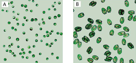
Microscopic view of tetraselmis algae. ©2004 Food and Agricultural Organization of the United Nations (FAO).
When marine algae are overfed with excess nutrients, their reproduction rates can increase significantly. Fertilizer containing these nutrients can find its way into lakes and oceans through runoff from agricultural farms, golf courses, and suburban lawns. Other nutrients get added from the atmosphere, soil erosion, upwelling, aquaculture facilities, and sewage plants. Try this simple experiment at home to see for yourself how the nutrients in fertilizers can trigger algal blooms.
The Sea-viewing Wide Field-of-view Sensor (SeaWiFS) is an instrument on the Orbview-2 satellite that monitors ocean characteristics like chlorophyll a concentration and water clarity. Using images and data from SeaWiFS, you can look for evidence of algal blooms and compare your findings with your backyard observations to see if there are any correlations between high levels of chlorophyll and sources of nutrients upstream in your watershed.
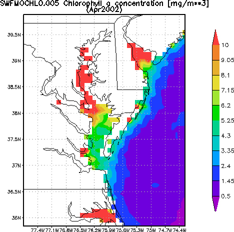
Nutrients from both point (single, identifiable sources) and nonpoint sources contribute to changing chlorophyll a levels in Chesapeake Bay. The step-by-step instructions below describe how to use Giovanni to explore monthly chlorophyll concentration, using Chesapeake Bay as an example. A very dry month (April 2002) and a very wet month (April 2003) were chosen to show how chlorophyll concentration in the Bay is affected by upstream conditions in the Chesapeake Bay watershed. These different conditions caused very apparent changes in the biological properties in the waters of the Bay and along the coast. During the wet month, there was increased water flow to the Bay. This led to increased runoff throughout the watershed and resulted in higher concentrations of nutrients reaching the Bay. You can adapt the procedures outlined here to study the mouth of your own watershed.
NOTE: All of the same operations described in this example can be performed with ocean color/chlorophyll data from the MODIS (Moderate Resolution Imaging Spectroradiometer) instrument aboard NASA’s Aqua satellite. As the youngest of NASA’s ocean color instruments, MODIS-Aqua is likely to be the sensor of choice for 2010 and beyond.
Supplies
- Internet connection
Procedure:
- Go to the Giovanni Ocean Color Radiometry Online Visualization and Analysis Global Monthly Products site to access the data.
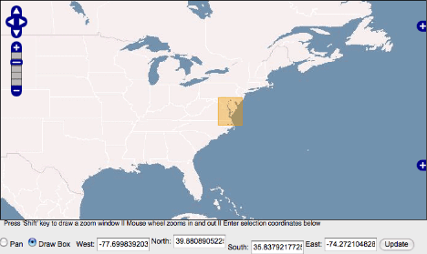
- Click and drag your mouse on the map to select your area of interest. Use the zoom and pan tools at the top left of the map window to help locate the exact region you want to study. Redraw the selection box as necessary. You can also enter latitude and longitude coordinates in the appropriate boxes to set the boundaries of your selection box on the map.
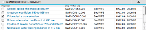
- Scroll down and select SeaWiFS Chlorophyll a concentration in the Parameters box.
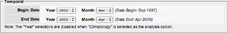
- Choose the Time Period: Begin Date: Year 2002, Month – April; End Date: Year 2002, Month – April. Leave the visualization type as Lat-Lon map, Time-averaged. And click the Generate Visualization button.
- Scroll down to the Edit Preferences box below the chlorophyll map and adjust the color bar settings. Click the radio button for Custom and enter a minimum value of 0.5 and a maximum value of 10. Then click the Submit Refinements button to refresh the page.
- Examine the resulting visualization. Chlorophyll concentrations are measured in milligrams per cubic meter (mg/m3). As the legend shows, red areas contain the greatest concentration of chlorophyll (and therefore the greatest concentration of phytoplankton), while the purple areas have very low chlorophyll concentrations. It is important to note that chlorophyll concentrations measured by satellite are less accurate near the coast (particularly in shallow waters) than they are farther offshore, but the measurements are still useful for observing changes in water quality.
- Change the Time Period to April of 2003 and generate a new visualization.

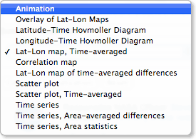
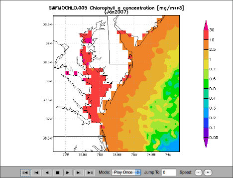
- Try looking at how chlorophyll concentrations in the Chesapeake Bay region (or some other region of your choice), change over the course of a year. Go back to the main Giovanni page and select your area of interest and the SeaWiFS Chlorophyll a concentration parameter as you did before. This time, set your start and end dates to cover one year (e.g., January-December, 2007). Instead of choosing the Time-Averaged Lat-Lon map, choose Animation as your visualization type and then click Generate Visualization. NOTE: Due to technical difficulties with the SeaWiFS instrument, which have since been remedied, there are a few months of missing data in the first part of 2008. If you would like to explore chlorophyll concentration for this time period, use MODIS-Aqua data instead.
- Use the control buttons at the bottom of the player window to watch the animation. Look for evidence of seasonal changes and periods of relatively high or low chlorophyll concentration.
 Consider the following questions for both the Chesapeake Bay and your own watershed: What correlations are there, if any, between high levels of chlorophyll concentration and nutrient levels upstream? What kinds of events might be responsible for changes in chlorophyll concentration over time? What are some ways to control the amount of nutrients being delivered to coastal waters from these types of pollution?NOTE: Because just a few days of elevated chlorophyll signals will typically dominate a monthly average, monthly data should be sufficient for identifying blooms and events. However, if you want to explore chlorophyll data at a higher temporal resolution to get a better sense of the timing surrounding a particular event, you might consider exploring SeaWiFS 8-Day data.
Going Further: Exploring Dead Zones
Dead zones are a growing problem around the world. Over the last 40 years, the number of identified dead zones has risen from less than 50 to over 400. Millions of tons of food and millions of dollars are lost each year as a result of hypoxic events. In the Chesapeake Bay dead zone alone, more than 83,000 tons of fish and other aquatic organisms fall victim to hypoxia every year. According to the August, 2008 Scientific American article Oceanic Dead Zones Continue to Spread, excess nitrogen is the primary cause for this global crisis.
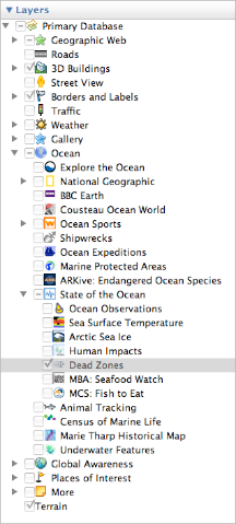
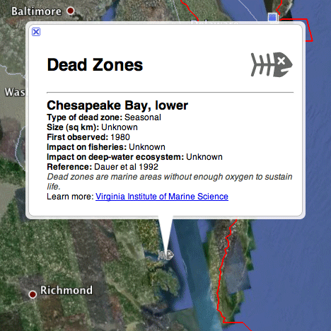
Google Earth has a new ocean layer that includes data on marine dead zones. To turn on the dead zone locations, first expand the Ocean layer options. Then, expand the State of the Ocean options and check the box for Dead Zones.
The location of each dead zone is identified by a skeletal fish icon. Click on the fish to get data on the nature and size of the dead zone, the date it was first observed, its impact on fisheries and deep-water ecosystems, and a reference.
To find out if a river in your watershed flows into the ocean next to one of these dead zones, open the USGS Elevation Derivatives for National Application (EDNA) Derived Watersheds for Major Named Rivers and find your local watershed. If you did not already download these maps for the Backyard Investigation, download them now from the USGS EDNA Watershed Atlas site.
Take a look at the Chesapeake Bay dead zone or any other dead zone of interest to you. Try navigating upstream (or up current) from these dead zones to see if you can figure out which land areas polluted freshwater might be coming from. As an example, the major source of water to the upper Chesapeake Bay is the Susquehanna River, which flows through much of the rich agricultural region of central Pennsylvania. If you would like to explore additional ocean data related to nutrient loading and dead zones, go to the Google Earth Ocean Gallery and download the World Resources Institute EarthTrends kml file, which displays areas that are eutrophic (characterized by excess nutrients) and hypoxic (low levels of oxygen), as well as improving hypoxic zones and naturally hypoxic zones where low oxygen levels are a result of seasonal changes in ocean currents and upwelling.
Consider your backyard observations in your local watershed, your Earth observations of ocean chlorophyll concentrations, and your Google Earth exploration of dead zones. Are you able to find any compelling evidence that land use practices in your local watershed might be having a negative impact on the ocean?
Water Quality
- Why Citizen Science?
- Backyard Observation
- Earth Observation
- Additional Resources