

Part II. Track Pollution from Space
To improve air quality, it is important to know what contributes to polluting the air. Haze comes from a variety of sources. Your skies may be hazy from local traffic, or industry such as for example coal burning power plants, or the pollution may be coming in from somewhere else farther away. Satellite images help identify large areas of pollution caused by fires, dust or sand storms, volcanic eruptions, large industrial sources, or the transport of man-made pollution from other regions. Smaller sources, such as small industries or local roads won’t be visible in satellite images.
Photo-like, true color images provide a very simple way to see if smoke, dust, or haze is being transported into your region.
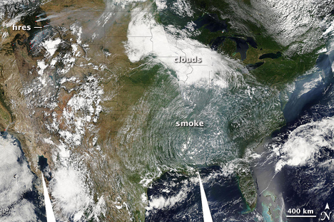
Smoke from western wildfires covered much of the United States on August 4, 2007. (NASA image by Holli Riebeek and MODIS Rapid Response).
This image shows the transport of smoke from forest fires in Idaho and Montana across the United States and over the Atlantic Ocean. The haze is gray-white and is smooth in texture compared to clouds.
Identifying Pollution in Photo-Like Satellite Images
- To access daily true color images of much of the world, go to the MODIS Rapid Response System. MODIS stands for the Moderate Resolution Imaging Spectroradiometer. It is an instrument that flies on two NASA satellites, Terra and Aqua. Both satellites orbit the Earth from pole to pole, so that each MODIS instrument sees the entire Earth every day. Terra MODIS passes overhead in the mid-morning local time, while Aqua captures images from the early afternoon. The MODIS Rapid Response System typically provides images within 4-6 hours after the satellite acquires them.
- Under “quick links” on the right side of the page, click on near real time subsets.
- The page will show a series of clickable maps and a list of subset areas. Click on the map to select your area of interest.
- This will bring up the most recent images of the region. Click on previous to browse back to earlier days.
- Click on the photo-like image (true color) on the left. A full-screen image will load.
- Under vector options (above the image), select fires + borders from the drop-down menu and click “select.”
Interpreting the Image
- Copy the image URL and paste it into the data sheet to make it easier to return to the image later.
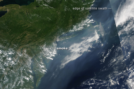
- In the comments field, note whether you see some kind of pollution in the image.Haze is usually gray-white and very uniform in texture. Dust tends to be tan, though the color varies depending on the type of soil that is being picked up by the wind. Smoke ranges from brown to gray-white. It is not always possible to identify what kind of pollution you are seeing, since smoke haze and dust can look alike, but you can look for potential sources in the satellite image.
-
Smoke
MODIS records the location of fires on the ground by observing unusual hot spots. The instrument doesn’t see every fire, but it will see large fires that may be contributing to air pollution. In these images, fires are represented with red dots.
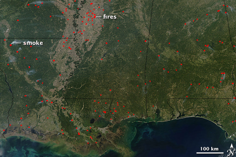
Red dots mark the locations of fires burning in the southern United States on October 15, 2005. Because there are several fires scattered across a wide region, they are likely agricultural fires, set to manage vegetation. Some of the fires produced white-gray plumes of smoke. Even though the fires are small, widespread burning can seriously impact regional air quality.
-
Dust
Not all dust storms are visible, but very large storms that last for several hours or days can be seen. The most common source of dust globally is the Sahara Desert. These giant storms sweep off West Africa and occasionally reach Florida and the Caribbean. By the time the dust reaches Florida, it is diffuse enough that it is difficult to see. If you live in Florida or the Caribbean, and you suspect that Saharan Dust may be clouding your skies, click on the images of northwest Africa and look back through the previous week to see if dense plumes of dust are coming off the continent. If you see a storm moving towards Florida, you can suggest that dust may be a contributing factor to the air quality.
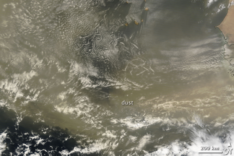
MODIS on NASA’s Terra satellite captured this image of dust blowing off the coast of West Africa on June 22, 2007. The storm lasted several days, crossing the Atlantic Ocean.
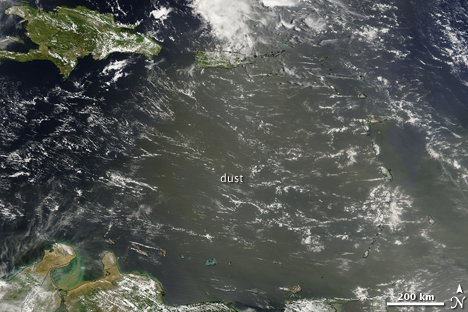
This image shows dust from the storm over the Caribbean on June 26.
Other dust storms may have a local source. Often dust storms come from a small area of exposed soil. Click on 250m to see the most detail possible in the image and look at the point from which the plume is originating. You may be able to identify the source of the dust. Look for a compact plume rising from exposed land. If you can identify the source, note it on the data sheet.
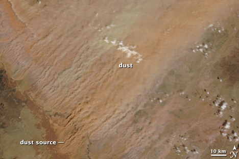
Dust sweeps northeast from distinct sources in central Arizona in this image from April 3, 2009. The dust plumes are tan and orange, depending on the type of soil that is being pulled into the air.
-
Haze
Haze from cars and power plants is gray-white in true color images. It is difficult to pin-point a single source, but you can see where the haze is.
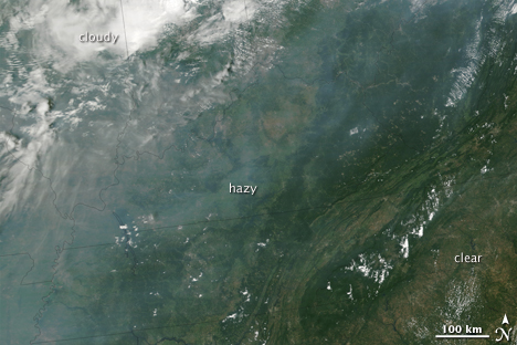
A band of haze hung over the southeastern United States on August 5, 2002. The haze is gray compared to the bright white clouds to the north. Haze blurs the ground beneath it. Ground features are distinct where skies were clearer (lower right).
-
- Record your observations of dust, smoke, or haze in the data sheet. In particular, make a note of pollution that could be entering your region from somewhere else.
Note: The Smog Blog routinely discusses air pollution as observed in MODIS imagery and may have information about an event you are tracking
Comparing MODIS True Color to EPA Air Quality Index
Satellite images are helpful in seeing long-range transport of pollutants from other regions, but they don’t tell you what pollution levels were on the ground. They see pollutants in the entire atmosphere, so the pollutants you see in the satellite image could be kilometers above the ground. To find out if the pollution you are seeing in the satellite image is on the ground, that is nearest to the surface you need to compare ground measurements to the satellite measurements. This can be done easily using Google Earth.
- As described in the previous section, locate today’s MODIS image of your area. Select fires and borders, and then click on, click on “download KMZ file for Google Earth.” Google Earth should automatically open and display the image.
- To get ground measurements, go to AirNow.
- Click on more maps, and then in the right menu, select, Air Quality on Google Earth.
- Follow the directions on the page to download the Air Quality Index into Google Earth. The file should open on top of the MODIS image.
- The data points that are exported are current measurements. Click on the circle nearest your observation location and note the time and date the data were updated. Does the date correspond to the date the satellite image was taken?
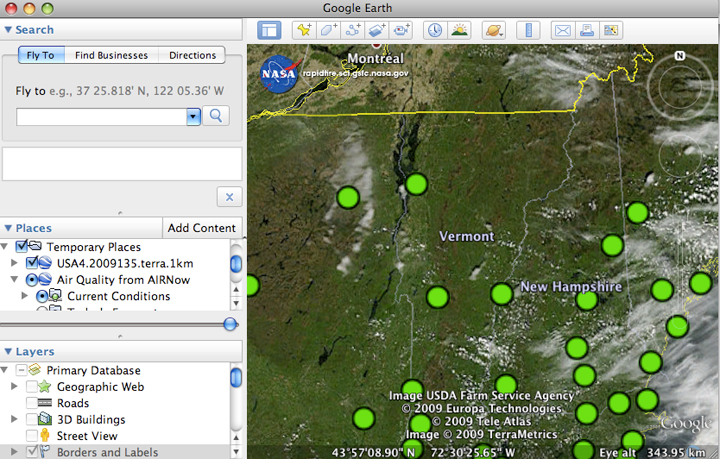
Current air quality conditions from EPA ground measurements are overlaid on a current MODIS satellite image in Google Earth.
- Record your observations about how the EPA ground measurements match the satellite image. Do areas with poor air quality (yellow, orange or red dots) correspond with haze in the satellite image? If so, you can attribute at least some of the pollution to the source identified in the satellite image. Note: there may not be an AIRNow dot close to your area. If that is the case, look for a dot that is within 100 km and use the measurements for that location.
Measuring pollution from space
Satellites measure the concentration of particles (aerosols) in the atmosphere by observing how much light reaches the surface of the Earth and how much is reflected off the aerosols. The measurement is called aerosol optical depth or aerosol optical thickness. It is the same measurement that may have made from the ground using a sun photometer. Using the following procedures, you can compare the satellite measurement of aerosol optical depth to the ground measurement from the sun photometer. You can also compare the satellite measurements with visibility or ozone concentrations to see the correlation.
NASA Earth Observations (NEO)
NEO was designed to provide easy access to global satellite images for teachers, students, museums and other public organizations, and citizen scientists. The system generates images based on data from various satellite instruments. For aerosol optical depth, a color is assigned to a range of aerosol optical depth values. NEO’s analysis tool allows you to click on the image to get the data value assigned to the color at the point you selected.
- To measure aerosol optical depth using NEO, go to the NEO web page.
- Click on the atmosphere tab under the map
- Select “aerosol optical thickness (MODIS)” from the drop-down menu. Aerosol optical thickness is the same measurement as aerosol optical depth.
- The most recent month will load on the screen. To compare the data to the daily values that you are tracking, you will want a daily image.
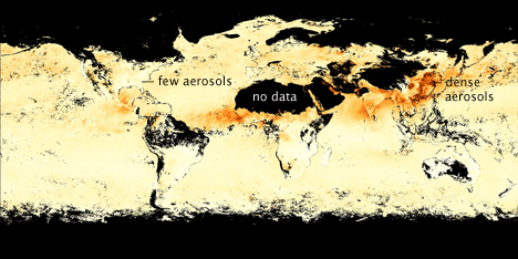
Aerosol optical thickness images reveal how much pollution particles blocked light. In this image, from the month of April 2009, dense aerosols (probably dust) extended west from Africa and hung over Asia (haze). The measurement can’t be made over bright surfaces like ice, deserts, or clouds, so these “no data” regions are covered with a black mask.
- Under “matching data sets” on the right side of the screen, select Aerosol Optical Thickness (1 day Terra MODIS or 1 day Aqua MODIS). If you made your measurement in the morning, choose Terra. If you made your ground measurements in the afternoon, choose Aqua.
- The most recent daily data will load. If you want to see a different date, scroll down the page and select another date from the list of search result. The previous and next buttons at the end of the list allow you to scroll backwards and forwards to see additional dates.
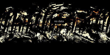
This daily aerosol image, from May 16, 2009, is mostly black. The aerosol measurement is not made over cloudy or bright areas like deserts or ice. Since most of the Earth is cloudy on any given day, large areas are covered in a black mask. The symmetrical wedges in the center are regions the satellite did not image on May 16. This image illustrates the necessity of analyzing a small region, defined by latitude and longitude, since a visual interpretation of daily data is difficult. Wider patterns are easier to see in the monthly images.
- Under search results, identify the date you are interested in. Click on Analyze this image under the date. This will put the data in the “analysis” shopping cart on the right side of the page. You can select up to three dates to analyze at once.
- Click “configure/launch analysis” under the analysis tab on the right.
- Click on the “select area” tab.
- Enter the latitude and longitude of your observation location. You will need to identify a small box around your area of interest. You can also click on the map and draw a box, but this method is less precise and harder to duplicate from day to day.
NOTE: you can get the latitude and longitude from Google Earth. Open Google Earth and zoom down to your location. Click on the location and the latitude and longitude should appear on the bottom of the screen.
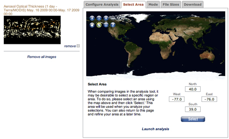
Type the latitude and longitude that defines your area of interest. “North” is the line bounding the northern edge of the areas, “south,” the southern
edge, and so forth. Note that positive numbers are degrees North and degrees East. Negative numbers are degrees South and degrees West. So, for 40 degrees North, you would enter 40, but for 40degrees South, you would enter -40.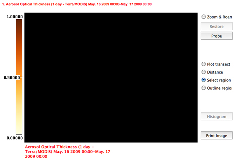
On May 16, the entire region was cloudy, so there were no aerosol optical thickness measurements, as indicated by the black mask.
- Click select.
- Click “launch analysis” at the bottom of the select area box.
- Select Probe
- Move the cursor over the screen until you find your latitude and longitude. Record the aerosol optical depth value for that location.
- Over time you can compare your ground measurements, the EPA air quality index for ozone and particles, and the satellite measurement of aerosol optical depth. You can also do these long-range comparisons using GIOVANNI.
Going Further: GIOVANNI
Using NEO, you charted the aerosol optical depth for your observation location. Another powerful tool for accessing, visualizing, and analyzing NASA satellite data is Giovanni. With Giovanni, you can correlate aerosol optical depth measurements for your region with EPA ground measurements of particles to find out if the aerosols the satellite measured were high in the atmosphere or close to the ground where they affect the air we breathe. You can also use data from another
satellite, CALIPSO, to find out where aerosols are in the atmosphere.
For instructions, please see Pollution in the United States and China on the Giovanni web site.
Air Quality
- Why Monitor Air Quality?
- Observing Your Air Quality
- Satellite Observation
- Additional Information